Product
Introducing Enhanced Alert Actions and Triage Functionality
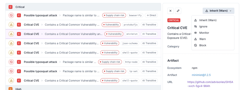
Socket now supports four distinct alert actions instead of the previous two, and alert triaging allows users to override the actions taken for all individual alerts.
@spectrum-web-components/icons-ui
Advanced tools
[Spectrum UI Icons](https://spectrum.adobe.com/page/icons/) delivered in a flexible template tag so that they can be leveraged across various frameworks. The default export of this package pre-applies the `html` template tag from `lit-html` for ease of us
Readme
Spectrum UI Icons delivered in a flexible template tag so that they can be leveraged across various frameworks. The default export of this package pre-applies the html template tag from lit-html for ease of use in the Spectrum Web Components library. Please remember to consult Spectrum's Iconography Guidelines when planning how to leverage these icons in the visual delivery of your application. For technical information on using these iconos in projects powered by various javascript frameworks, check out the "Extended use cases" sectino below.
yarn add @spectrum-web-components/icons-ui
With the default exports of the packages prepared with the html template tag from lit-html, the default value of an icon export will be as follows:
import { LitElement, html } from 'lit-element';
import '@spectrum-web-components/icon';
import { AsteriskIcon } from '@spectrum-web-components/icons-ui';

class ElementWithIcon extends LitElement {
    protected render(): TemplateResult {
        return html`
            <sp-icon>
                ${AsteriskIcon()}
            </sp-icon>
        `
    }
}

customElements.define('element-with-icon', ElementWithIcon);
Every icons can be customized via the following options:
{
    width: 24, // number outlining the width to deliver the SVG element with
    height: 24, // number outlining the height to delivery the SVG element with
    hidden: false, // boolean representing whether to apply the `aria-hidden` attribute
    title: 'Icon title', // string of the title to deliver the icon with
}
The default exports of this package are pre-wrapped via setCustomTemplateLiteralTag in the html template tag from lit-html, and work liek the following::
import { AsteriskIcon } from '@spectrum-web-components/icons-ui';

console.log(AsteriskIcon());

/***
TemplateResult {strings: Array[1], values: Array[0], type: "html", processor: DefaultTemplateProcessor, constructor: Object}
***/
When working in the context of other frameworks, it is possible to import the icons with a generic template tag as follows:
import { AsteriskIcon } from '@spectrum-web-components/icons-ui/src/icons.js';

console.log(AsteriskIcon());

/***
<svg
    xmlns="http://www.w3.org/2000/svg"
    viewBox="0 0 36 36"
    role="img"
    fill="currentColor"
    height="24"
    width="24"
    aria-hidden="false"
    aria-label="Circle"
>
    <circle cx="18" cy="18" r="16"></circle>
</svg>
***/
What's more, if you're already working with a specific parser in your project, you can assign it as the one to use when delivering the icons in order to be sure that the SVG content is delivered as parsed content to your final template. The means if you were working with Preact via the htm tag as bound to the provided hyperscript function:
import {
    AsteriskIcon,
    setCustomTemplateLiteralTag,
} from '@spectrum-web-components/icons-ui/src/icons.js';
import htm from 'htm';
import { h } from 'preact';

const hPreact = htm.bind(h);

setCustomTemplateLiteralTag(hPreact);

console.log(AsteriskIcon());

/***
VNode {nodeName: "svg", children: Array[1], attributes: Object, key: undefined, constructor: Object}
***/
In this way the icons exported by @spectrum-web-components/icons-ui can be leveraged in projects powered by the the likes of hyperHTML, lighterhtml, lit-html, Preact, React, Vanilla JS, Vue.js, and more!
FAQs
Deliver [Spectrum UI Icons](https://spectrum.adobe.com/page/icons/) as either:
We found that @spectrum-web-components/icons-ui demonstrated a healthy version release cadence and project activity because the last version was released less than a year ago. It has 10 open source maintainers collaborating on the project.
Did you know?

Socket for GitHub automatically highlights issues in each pull request and monitors the health of all your open source dependencies. Discover the contents of your packages and block harmful activity before you install or update your dependencies.

Product
Socket now supports four distinct alert actions instead of the previous two, and alert triaging allows users to override the actions taken for all individual alerts.

Security News
Polyfill.io has been serving malware for months via its CDN, after the project's open source maintainer sold the service to a company based in China.

Security News
OpenSSF is warning open source maintainers to stay vigilant against reputation farming on GitHub, where users artificially inflate their status by manipulating interactions on closed issues and PRs.